PAULINA LAM
Mirror
DESIGNLAB UX PROJECT CASE STUDY


overview
PROJECT TYPE
UX/UI, Responsive Design, Branding
TIMELINE
80 hours
MY ROLES
User Research
Strategy
Interaction Design
UI Design
Prototyping
Usability Testing
TOOL USED
Figma, Illustrator
the challenge
Mirror, established in 1994, is a successful clothing retail chain that has lagged behind in spreading to the e-commerce world. They sell affordable and stylish clothing for children, men, and women. Over recent years, they have recognized the benefits of e-commerce for both the business and its customers. Mirror seeks to modernize its brand and develop an online presence for its target market, the working adult who seeks to both lead and keep up with current fashion, joined with basics and timeless pieces.
the solution
Develop a responsive e-commerce website (compatible on mobile, tablet, and desktop) where customers can easily browse and purchase apparel. I also refreshed Mirror’s logo and branding to reflect the changes made to the website.
design process
Research Goals
-
Define and understand the target market
-
Discover motivations consumers have behind shopping online versus in-store Identify the needs, desires, and pain points customers have while shopping e-commerce
-
Analyze top competitors to determine strengths and weaknesses
Research Method
-
Competitive analysis - determine who the major competitors are. How can we improve upon or emulate the features they have
-
Survey - to obtain quantitative and qualitative data about consumer behavior
-
1:1 Interviews - interview 3-5 current users and online shoppers to obtain qualitative data to discover pain points, wants, needs, and goals when shopping online.
Using both qualitative and quantitative research methods, I started off by conducting a competitive analysis to determine the strengths and weaknesses of similar companies, and market research to analyze existing retail statistics. I then obtained further information from surveys and user interviews to gain a further understanding of the user. Through qualitative, open-ended interviews, I was better able to build empathy with potential users and uncover current behaviors.
Competitive Analysis
design process
Develop a responsive e-commerce website (compatible on mobile, tablet, and desktop) where customers can easily browse and purchase apparel. I also refreshed Mirror’s logo and branding to reflect the changes made to the website.

define
Empathy Map & Persona Development
After identifying user behavior and need patterns and establishing research-based guiding principles, research was synthesized into a set of deliverables, which would guide all stakeholders in keeping the users as a priority in the user-centered design process.
Based on my research, I created my primary persona, Madelyn. She enjoys wearing contemporary and fashionable clothing at a reasonable cost. She works full time and appreciates the convenience of being able to order clothing so she can enjoy and appreciate a work-life balance.
This persona served as continuous reminders of the characteristics of the kind of people who would visit Mirror throughout the design process.

A product goals chart was also in order to determine where the users’ needs and the company’s needs overlap. This chart was designed with the intention to help keep all perspectives in mind in order to create a product that is beneficial for everyone.

Card Sorting Exercise & Site Map
I conducted a card sorting exercise in order to see how potential users categorize apparel related items. Using results from this exercise and competitive analysis, I was then able to design Mirror's site map. The pages and subpages were categorized in a manner that would make sense to users.
.png)
ideate
Task Flow
Using our (thus far) findings and developed persona, I was able to prioritize features for the site and chart a task flow. The task flow show's the most common path for a user from their entry point to the final end goal of purchasing an item.

User Flow
I then took the task flow and predicted various ways a user would end up on the site and what possible actions and decisions they could make, providing a user flow. Mapping this user flow helped me understand the key screens to prioritize as I began wireframing.

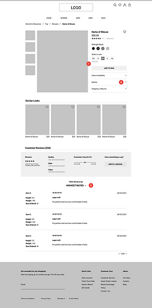
Wireframes
Based on user research findings and key task user flows, I built wireframes by using Figma. This set of initial wireframes shows the site pages that a user would encounter as they progress from entering the site on the home page towards looking for an item of clothing (specifically for this flow: looking for a blouse on sale).


Style Guide & Logo
A style guide was created to match the brands new look and aesthetic and inform the design of the website. The new Mirror logo was inspired by the clean and modern lines of the style guide created.

UI Kit
Following the Style Guide, I crafted a UI Kit that would inform the Design System for Mirror.

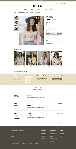
Mock UpsI incorporated the branding and UI into the wireframes and made significant revisions based on feedback.


.png)
test
Usability & Testing
I created a high-fidelity prototype of the main user flow through Figma in order to test the usability of the website. My main goals were to:
-
Determine the usability of the new Mirror site and observe how easily a user can complete the supplied task
-
Make note of any difficulties for further iteration/improvement
-
Collect feedback from users on ease of navigating the website
Through a variety of methods including in-person usability tests and remote tests with Zoom screen share, I was able to assess the user experience according to my test goals.
I tested the Mirror prototype on a total number of five participants. The task was for each user to browse and find a Satin blouse on sale for a female friend.
Key Findings
Overall, users were able to navigate the site smoothly and find the item efficiently. Feedback was related to both the browsing experience as well as the UI and aesthetics.
-
All 5 participants successfully completed the task
-
4 of the participants felt the tasks were straightforward and easy
-
4 of the participants went through the Sale tab to get to the first task
I compiled all of the usability test data into an affinity map to visually represent successes, points for improvement, and recommendations.

next steps
Moving forward, the next steps for the project would be to continue wireframing, prototyping, and conduct usability testing for the remaining pages of the website. It is important that the website be constantly updated to meet user needs and coincide with industry standards. I can do this through continued market research, usability testing, as well as continuing to iterate on existing web pages.